In the world of business aviation, you see a lot of aircraft interiors that feature neutral colors like beige and grey. The simple color palettes are perceived as a safer option since they appeal to the masses and help with resale value.
Occasionally, a customer personally values creativity and is willing to take the plunge into a unique design. This Gulfstream V is a prime example.
“Working with a customer who is open to creative and fun designs is one of my favorite things to do,” says Senior Lead Designer Molly Pfeiffer. “Each individual detail of this aircraft had a unique aspect that came together to produce something absolutely beautiful.”
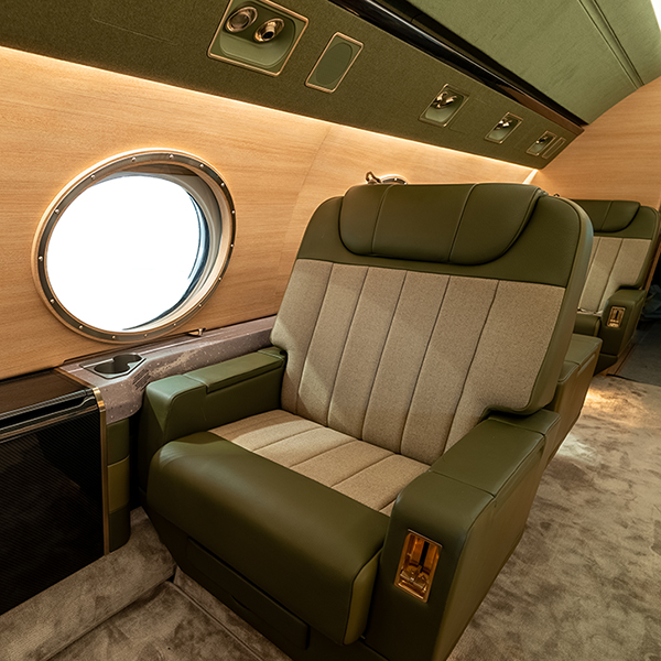
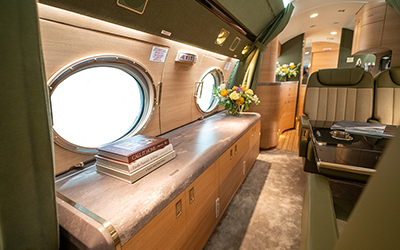
This newly refurbished Gulfstream is a show piece that emulates the creativity and craftsmanship of Duncan Aviation. Some of the details include two-tone leather seats with a fabric insert, porthole window surrounds, vinyl-wrapped sidewalls, carbon fiber table boxes, and a stone look used throughout that really makes it a one-of-a-kind show piece.
At first, the owner wasn’t sure which direction he wanted to take with the interior. We played with multiple ideas and fine-tuned the various visions until the current design came forward.
“The colors and finishes were inspired by the Albatross we refurbished years ago,” explains Molly. “He was searching the internet for inspiration and came across photos of the Albatross. He loved how the wood tone and green looked together.”
Carlo Borromeo, owner of BorromeodeSilva, has a history of working with the owner and understands the owner’s design preferences. Carlo and Molly worked together to ensure the new interior fit the owner’s taste, and was aviation-approved. Carlo came up with the overall vision, and Molly brought it to life.
“Most of the big ideas came from Carlo and his team,” says Molly. “I ensured the materials they selected fit aviation requirements, and came up with a lot of the details on how to execute the vision with the unique concepts we were trying to achieve.”

Molly compared the look of the seats in the aircraft to a handsome, custom-tailored suit. They are highlighted by two-tone light and dark green leather on the arms and seat surrounds yet the herringbone fabric insert is really what catches the eye. We added pull lines that ran vertically along the fabric to add depth and dimension to the seats and make the inserts pop.
“These are some of the most handsome seats I’ve ever done,” says Molly. “They remind me of a custom- tailored men’s suit with clean lines, pull details, and hidden seams. The simple design and patterned fabric create a clean look that is interesting and draws you in.”
Every aspect of the seats was hand- cut by the Upholstery shop at the Duncan Aviation facility in Provo, Utah.
Upholstery Team Leader Brandon Crosby explains that the headrests are larger than we normally see.
“The larger headrest fits the head better, and gives more of a predominate appearance,” Brandon says. “A lot of the time with smaller headrests, it hits the head at an odd spot. When the larger headrests are up, there is more surface cushion for the head to relax on.”

Carlo had previously designed the owner’s yacht and wanted to incorporate some of the same design aspects into the aircraft. To do this, the team modified the windows to resemble a porthole, and installed LVT (Luxury Vinyl Tile) flooring in the entryway and lavatory.
Brandon and his team used 2.5”- wide LVT planks that resemble the teak wood often used in yachts. The CNC shop cut out 1/8”-wide strips of aluminum that were powder-coated black and placed between each row. The result closely resembles the flooring typically seen in yachts.

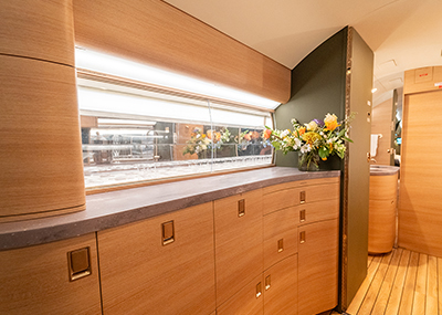
Carlo wanted a stone look to be incorporated. Because of weight restrictions, Molly suggested using a hydrographic film that mimics the appearance of stone without adding weight. Using hydrographics the stone appearance could be applied on the tight radiuses of the drinkrails and credenza. This is a prime example of how Carlo provided vision and Molly brought it to life.
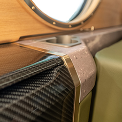
The drinkrails, credenza top, and countertops were all hydrodipped with the stone look. The table boxes, tabletops, and grab rails were hydrodipped as well, using a carbon fiber film.
The drinkrails and table boxes were completely modified to achieve a sleeker, more modernized cabin that is more in line with newer models. At input, the tops of the drinkrails were at different heights, and the lower sidewalls were just a leather bump-out. The team redesigned them, making them the same elevation and creating two-level drinkrails. We focused on details such as making custom cupholders specific to the owner’s cups, and applying powder coating to give them a durable finish that complemented the color of the stone. We also added metal plating to flank both sides of the table, mirroring the table card boxes, which have a strip of plating running along either side.
The upper sidewalls were vinyl- wrapped and appear to have a straight grain, light oak veneer.
“This was a first for our team,” explains Molly. “We wanted to achieve the look of veneer throughout a majority of the cabin, including the upper sidewall. The wrap allowed us to have the veneer aesthetic without having to solve the challenges of using real veneer.”
The owner likes to rest and have quiet in the aircraft, so he was looking for a way to improve the sound quality in the aft area. The team installed multiple components throughout the cabin.
Soundproofing blankets were added as well as a thicker carpet pad to absorb extra sound. We modified the curtain design with a thick- pleated structure to help with functionality and also create a more pleasing aesthetic when the curtains were open or closed.
The carpet is a luxurious, handmade, 100% silk carpet. The unique characteristic to an all-silk carpet is that the yarns lay different directions when you walk on it, almost creating a marbling effect.
The aircraft also received Prizm lighting upgrades that allow passengers to change the color and temperatures to get warmer and cooler lighting. An Alto Cadence sound upgrade and Collins CMS Venue were installed. The CMS features new touchscreen monitors in the armrest.
The project was capped off with the installation of the recently certified Starlink high-speed, in- flight internet connectivity system.
Brandon says this was a big feat for his team, and they did a great job tackling it. “The team came together and put out a project that looks outstanding. We typically see a lot of tans and greys, so it was nice to work with something different. It’s sharp.”
Molly says the attention to detail and high levels of quality artisanship on all aspects of the project really made this a piece of flying art.
“At the end of the day, my design is nothing without the craftsmanship of our teams being able to bring it to life,” she says. “It’s not your standard aircraft.
It has so many unique details woven throughout the interior and everyone here was so patient and really executed those details perfectly. I couldn’t have been happier with how the final product turned out; it was even better than I envisioned.”
View the full gallery of photos or the refurbishment video.